Building an online booking solution for activity operators.
Background
The world books online
Over 148 million people book accommodations, tours, and activities online. Inspiring descriptions, transparent pricing, and the ability to book straight away - these are the key ingredients to make offers stand out from the crowd.
But many tour operators fail
With a limited amount of time and missing skills, many small activities and tour operators lack the capability to market themselves professionally online. Uninspiring company websites with missing information and no possibility to book directly means additional time and resources on both seller and buyer side.
Let’s get this right
How can we enable small tour & activity operators to provide relevant offer information to their clients online easily?
Understanding the challenge
As a first step, we started reviewing websites of tour operators and interviewed experts and our target group.
We were trying to understand what are the key challenges, for providing the right offer information and making offers directly bookable.
Problems to solve
- Operators lack experience on what information is important to potential clients
- No direct booking plugins for multi-day tours for Wordpress
- Bookingkit and Bookinglayer are expensive and not attractive from a user experience point of view
- Operators lack time as they have to be out with their clients
Minimum awesome product
Based on the above problems we were defining top 3 features for our minimum awesome product
Key Features
- Easy and fast to set up tour & activity pages, highly assisted and engaging workflow - no tech-skills required
- Easy and fast management of online availabilities and bookings
- Cost-efficient in usage
Creating a prototype
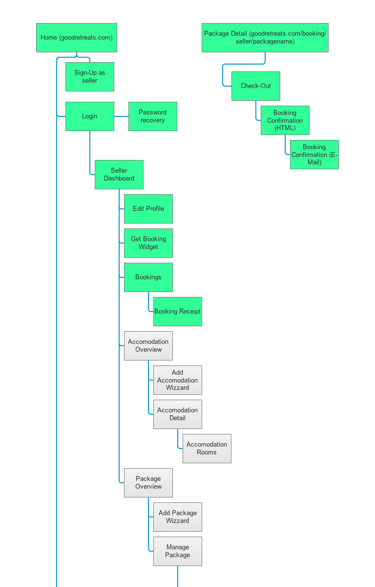
We started by creating user journeys and building basic site flow
Later we translated this into an interactive prototype and tested with selected users
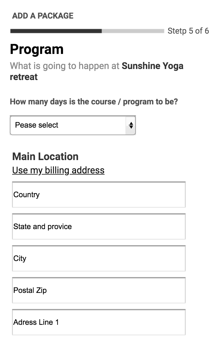
Challenges encountered during user testing
- How might we make offer creation an engaging process - nobody likes to fill lengthy forms
- How might we make managing bookings simple & accessible
- How might we make offer pages look more personal
- How might we make it easier to edit offers after creation
Defining visual language
Hello Booking Rebel
Activity operators are often selling through marketplaces or listing sites. As opposed to this, we are offering a set of tools to empower them to sell directly to their customers - being a rebel and standing out from the crowd by selling direct - our brand’s name background.
Logotype
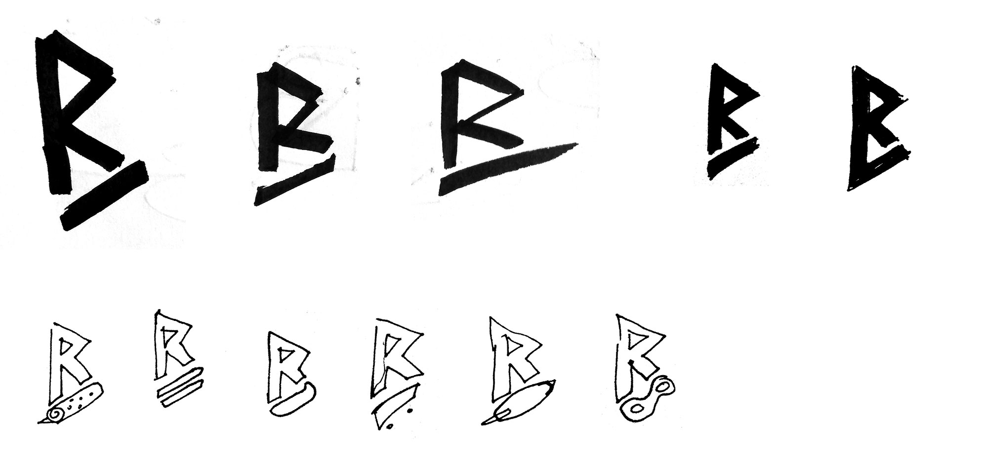
From dozens of sketches, we picked a BR monogram with a customizable lower part to appeal to various activity providers out there.

Edgy lines and notable contrast of the icon allow for usage in various sizes without sacrificing readability and creating a connection to the target audience.

Icon and wordmark combined
Color palette

Vibrant color palette to support the rebellious nature of the brand
Typography

Knile - a contemporary slab serif for titles and headers.

Silka - geometric sans-serif, for body text and sub-headers, works equally well on screen and offline
Iconography

Material icons - modern and minimalistic icons, available in a variety of styles ranging from lightweight outlines to dense, filled pictograms
Illustrations
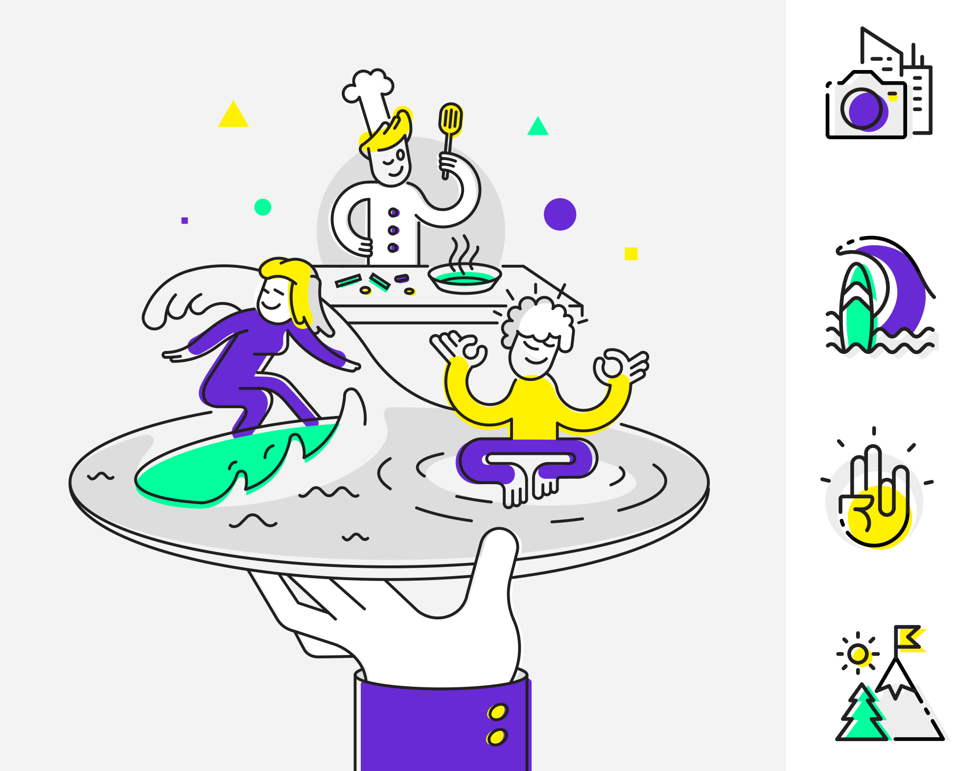
Clear motifs, composed out of lines with added solid-colored shape accents.
Imagery




Authentic activity shots, showing people and their work
Building a final product
Onboarding and offer creation
Challenge
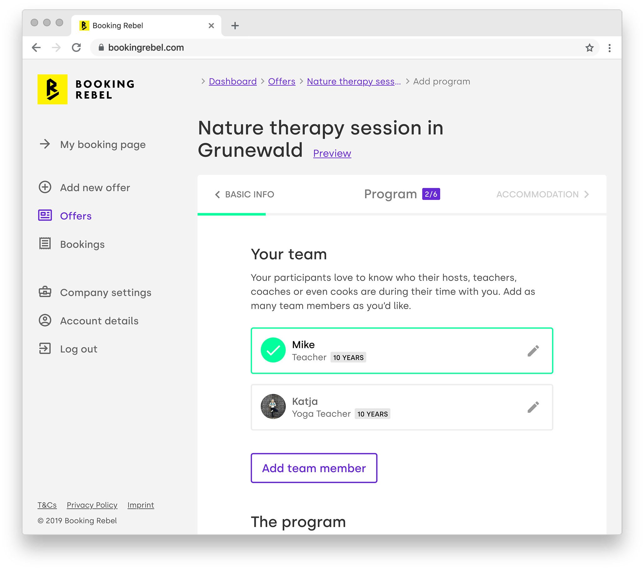
The engaging offer creation process
Solution:
Guiding users through the creation of their first offer, breaking offer creation in multiple logical steps, and saving the progress - these components help users advance faster and make it easier to resume offer creation later on. Using friendly and engaging copy and allowing the users to preview the offer - keeps them motivated.
Managing bookings on the go
Challenge
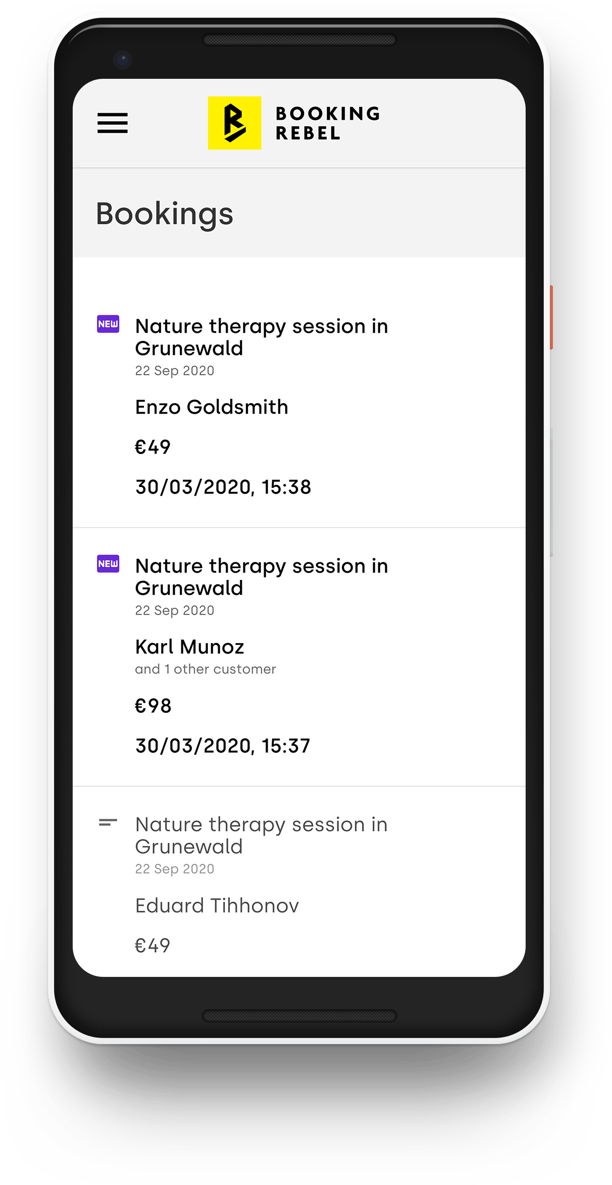
Easy & accessible booking management
Solution:
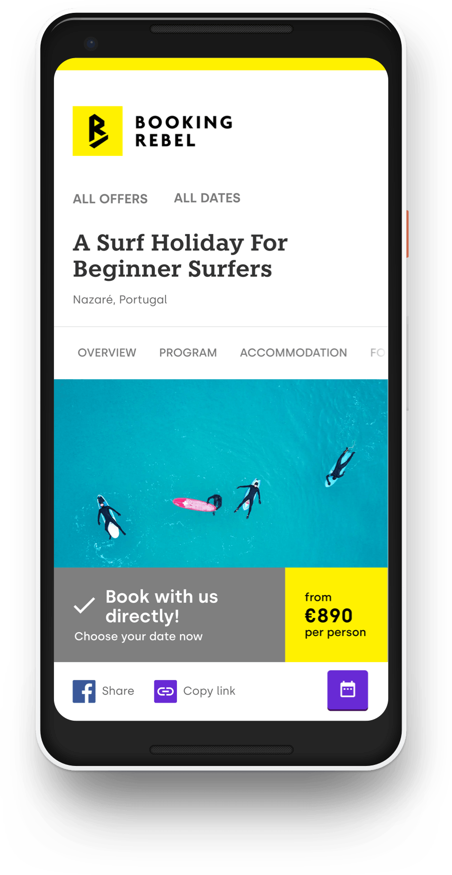
Simple email notification upon new booking and responsive, mobile-first page - make it a breeze to manage reservations on any device.
Personalized offer page
Challenge
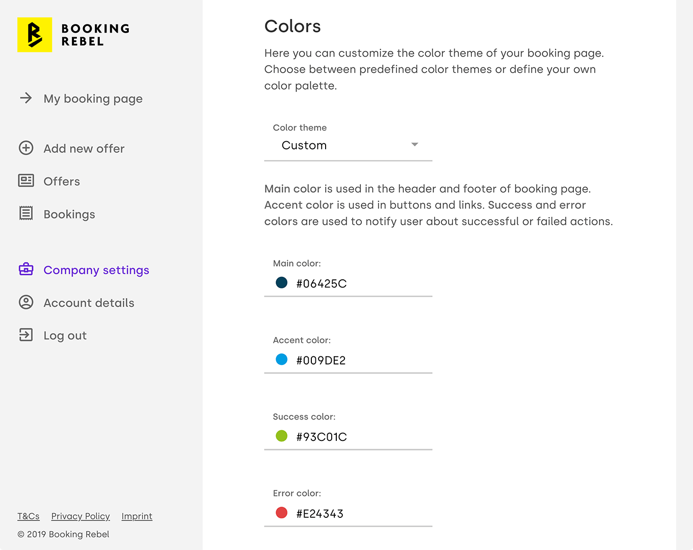
Making offer pages look more personal
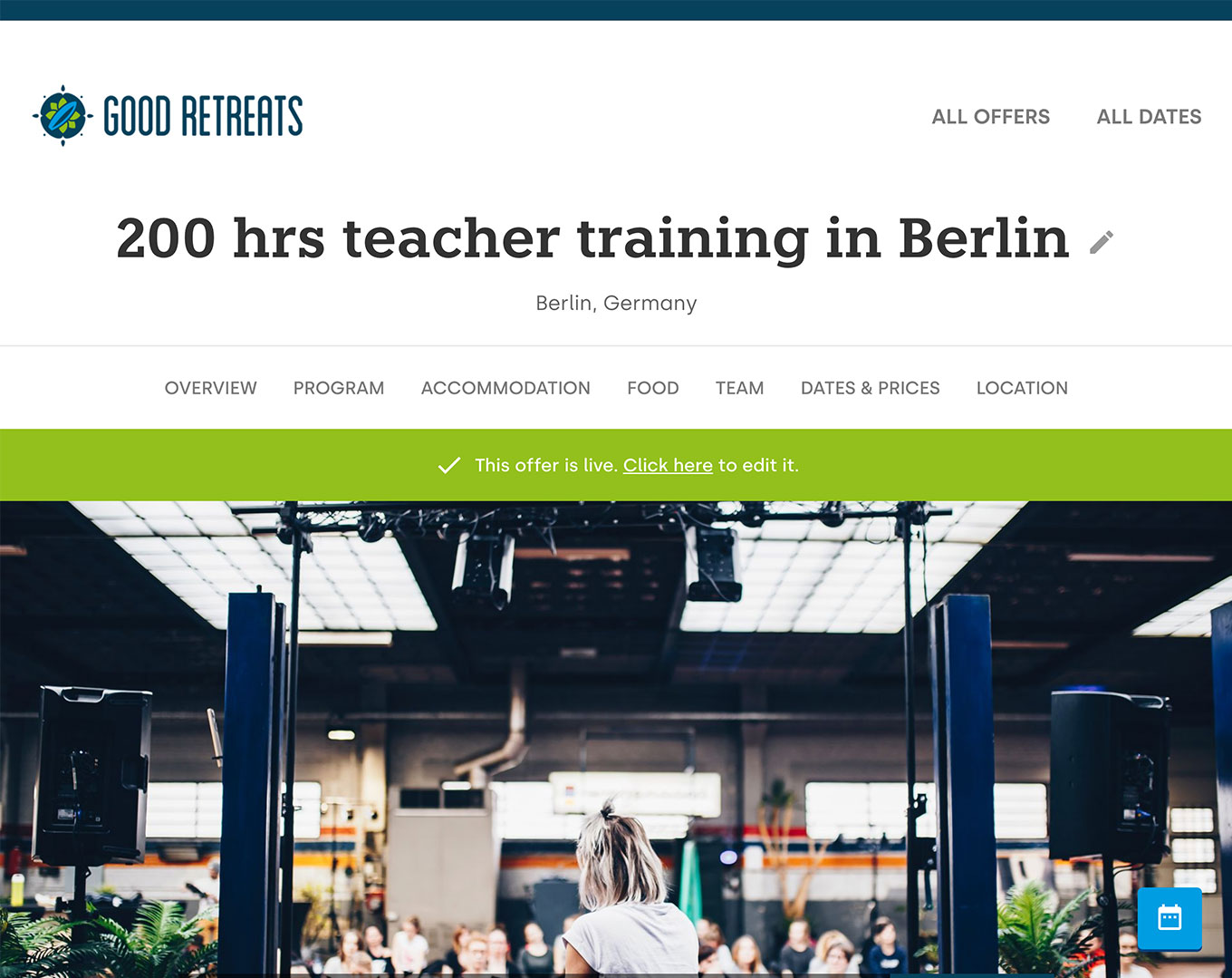
Solution:
Add the ability to change colors and upload a company logo
Keeping your offer page always up to date
Challenge
Keeping it easy to edit existing offers
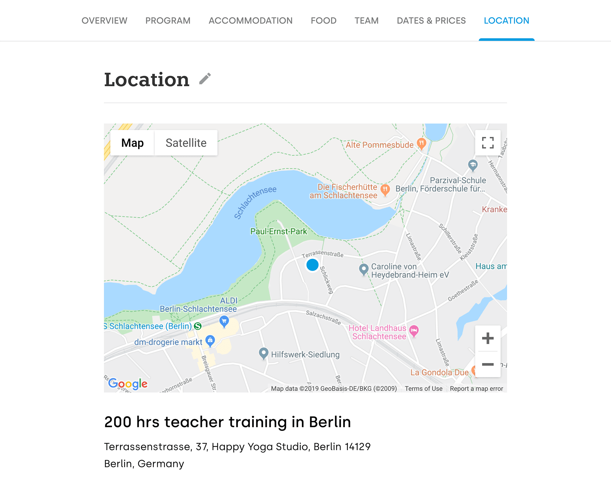
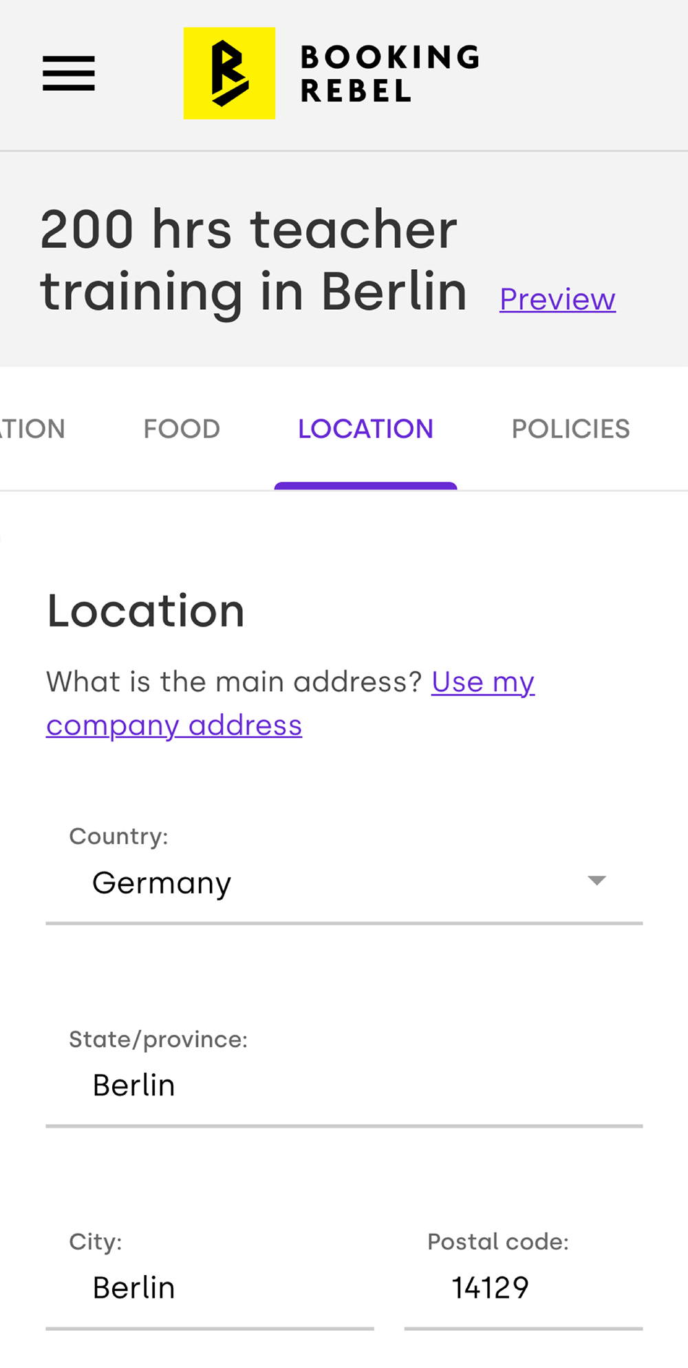
Solution:
Let users jump straight to the relevant section from their offer page
Launch
Booking Rebel landing page

Alongside the launch of the Booking Rebel, we’ve created a landing page showcasing the product and serving as a launchpad for all marketing activities.
Feedback

I’ve set up my booking page in minutes. Now I spend less time answering emails and can focus on what I enjoy doing most - making my guests happy. Thank you!
Katja from Harmony in Life Yoga
Responsibilities
User flow, wireframing, usability testing, user experience design, user interface design, visual identity, implementation frontend & backend
Tools & technologies used
Adobe XD, React, Netlify, Node.js, Prisma, GraphQL, AWS
