Developing a visual identity for product-centric consultancy
Background
Product at Heart is a Berlin-based product consultancy helping organizations of all sizes to exceed their goals by putting the product at the center of their business strategy. Offered services revolve around growth, culture, and design.
Challenge
Create a playful, engaging, and modern visual identity while maintaining a professional, business-oriented touch.
Process
Icon & wordmark explorations
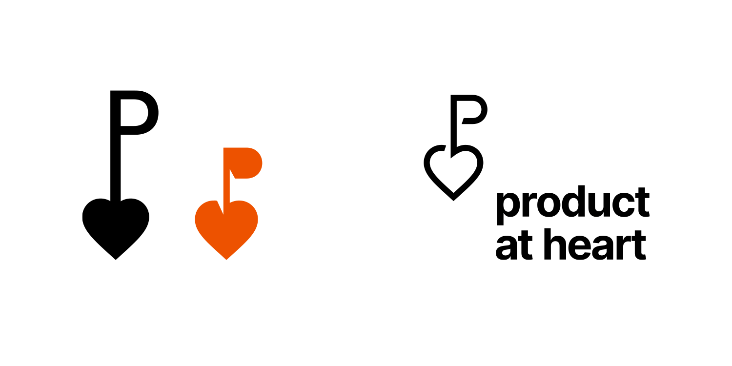
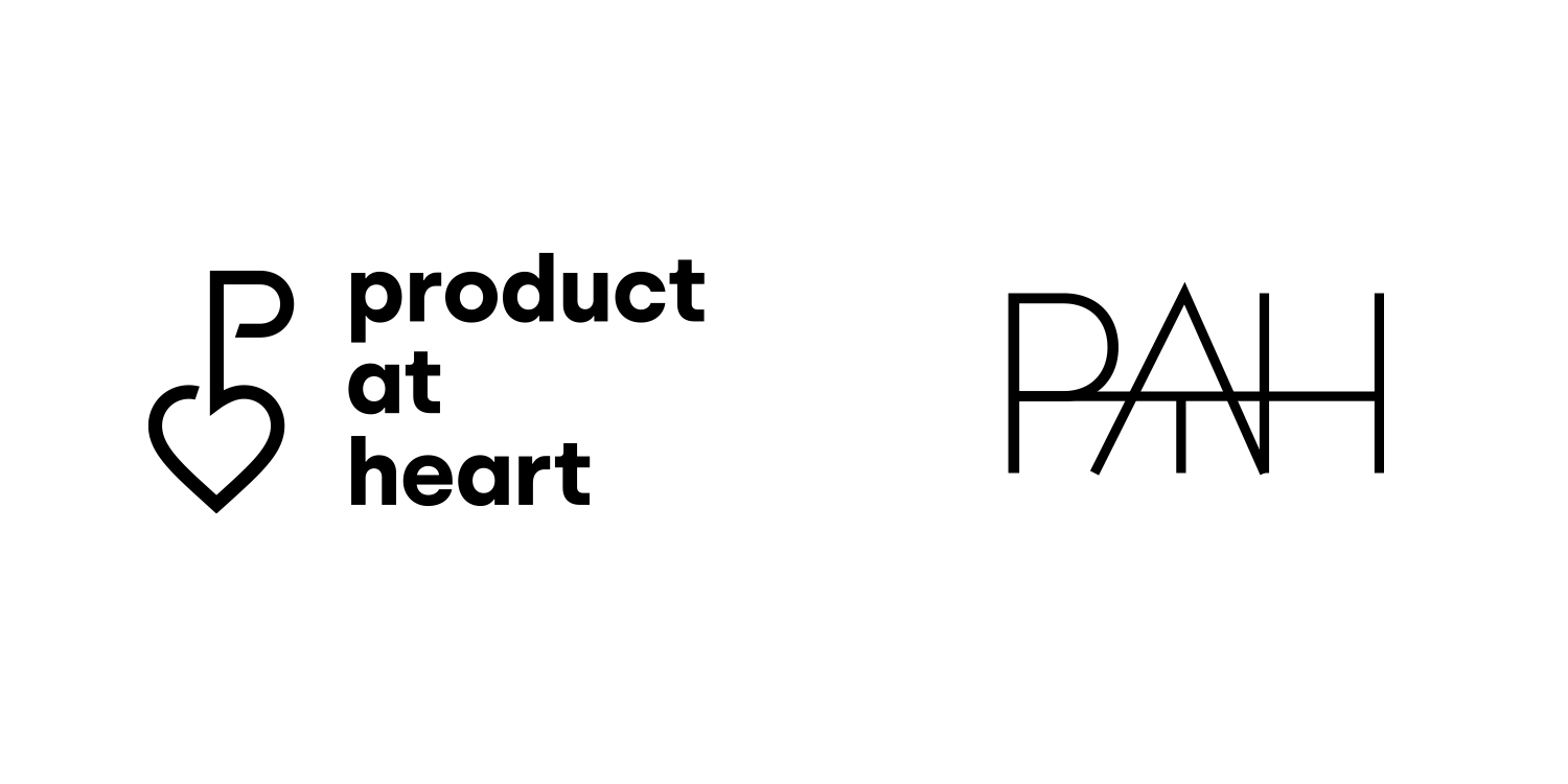
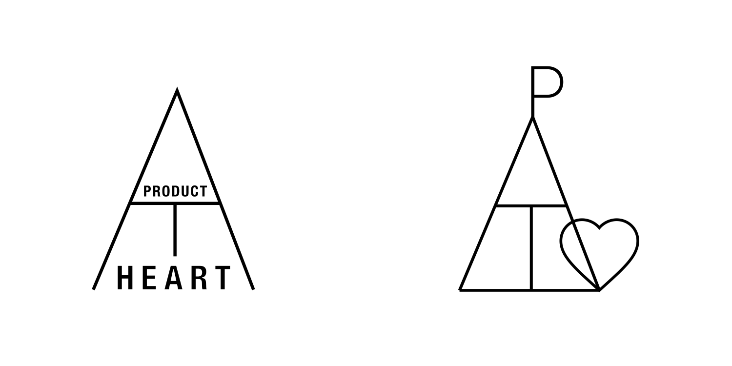

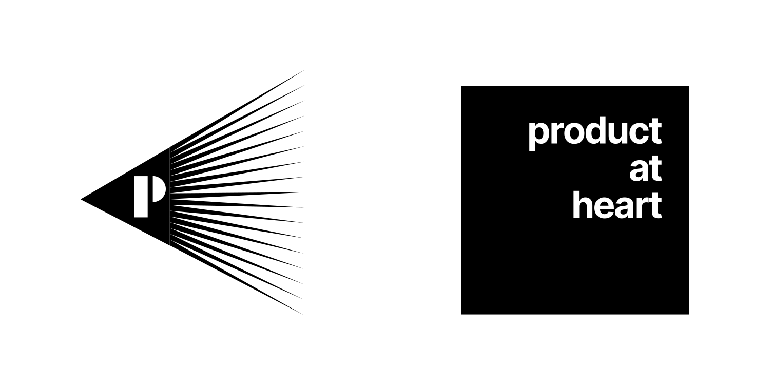
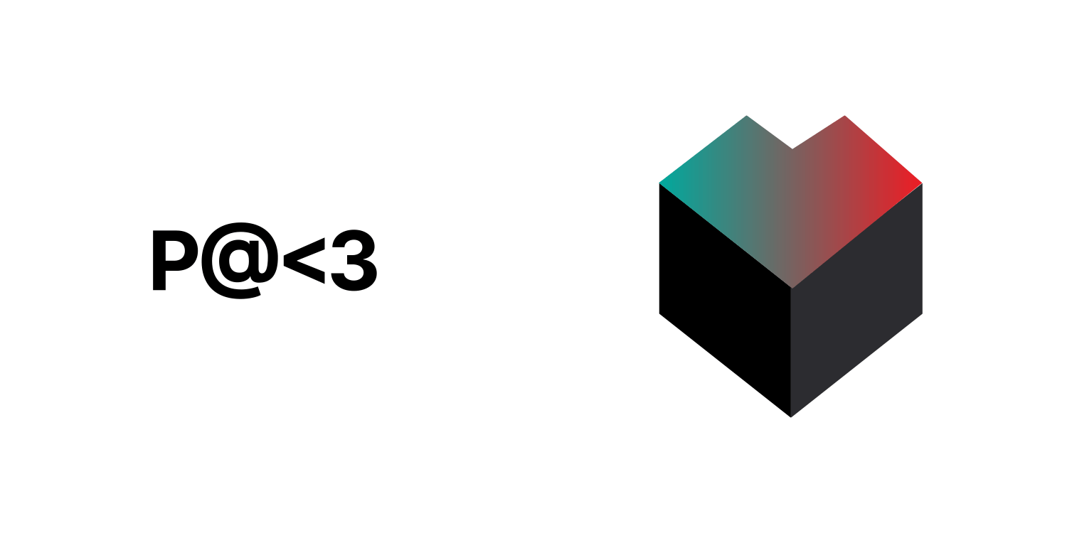
Product at Heart becomes PATH
During the feedback session client picked the wordmark constructed from capital letters P A T H and shortened company name to PATH, asking to create additional sketches exploring this route.
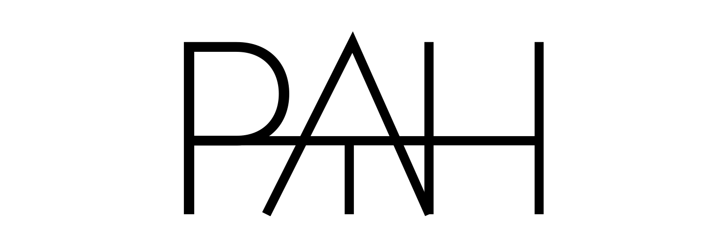
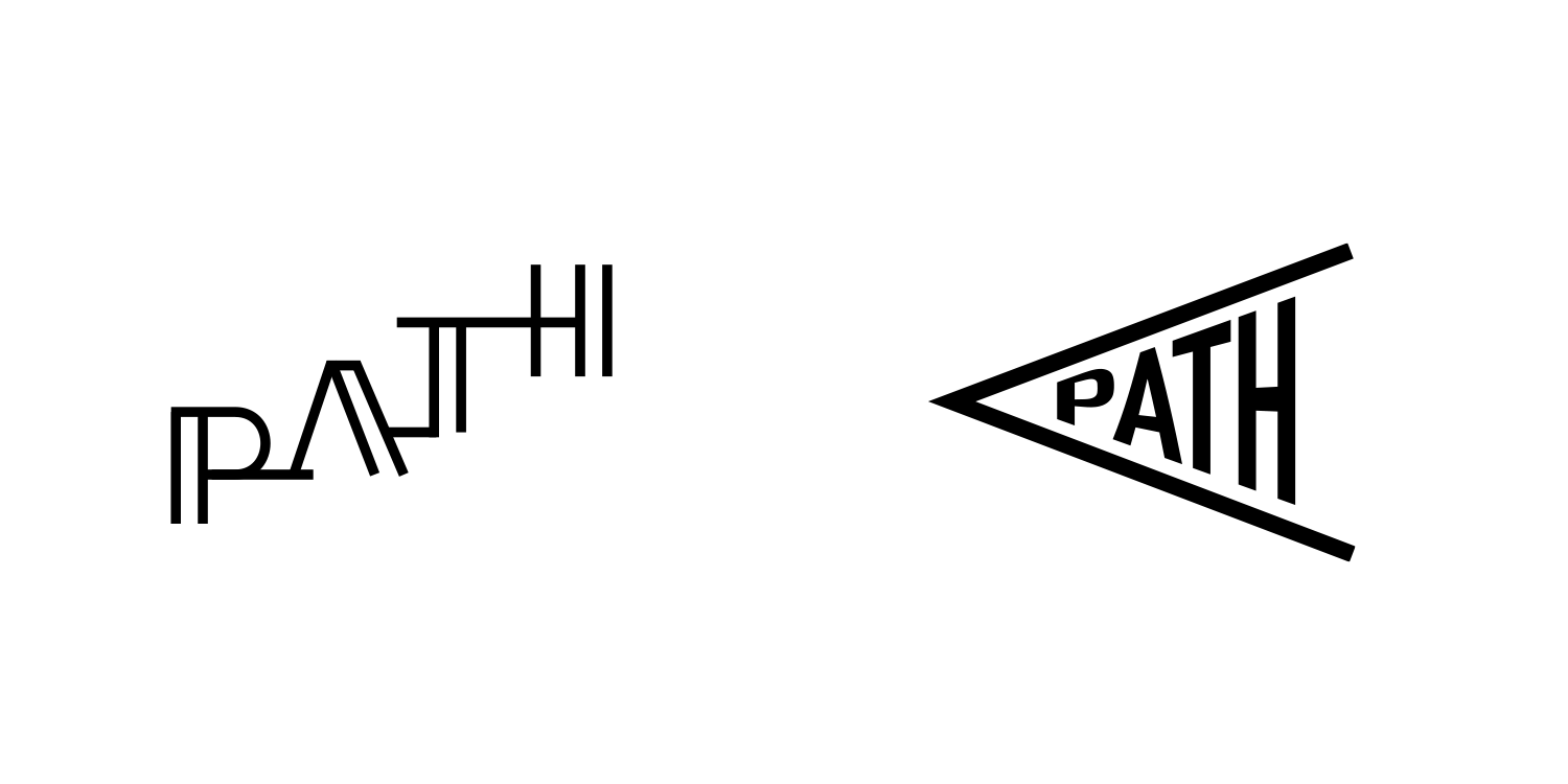
Exploring PATH
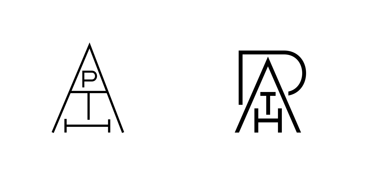
Final logo
Creating visual language
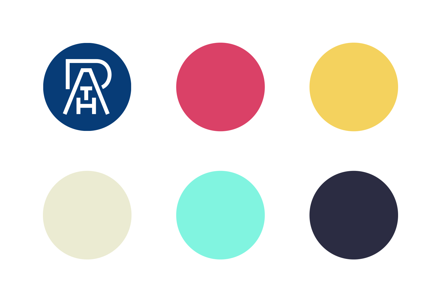
Color palette.
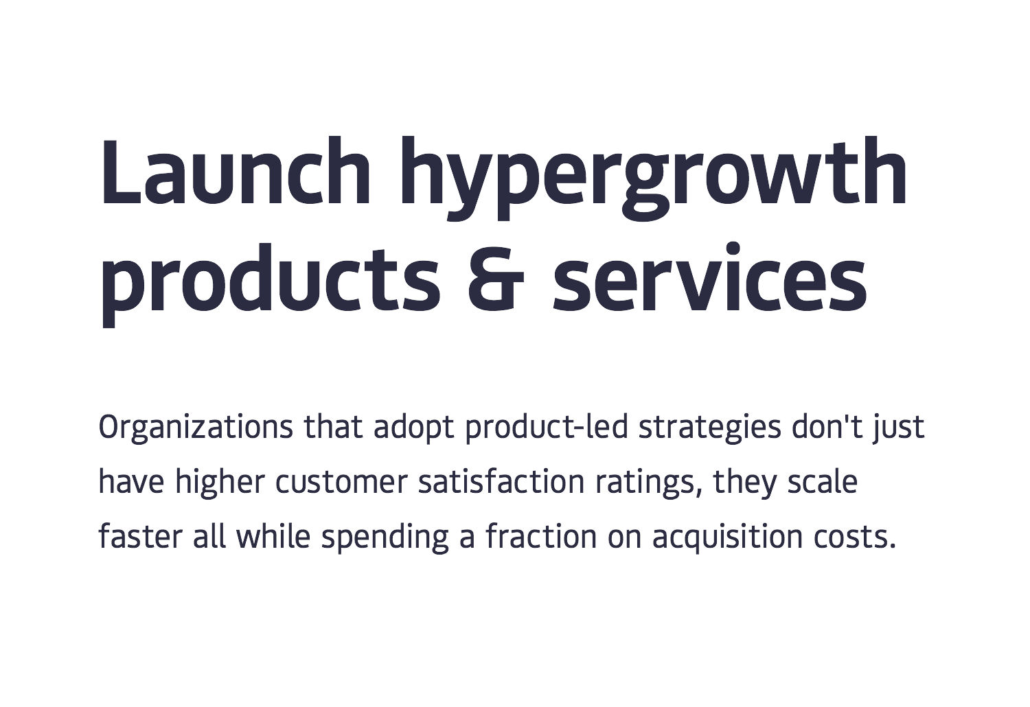
Bould - a humanist sans serif typeface.
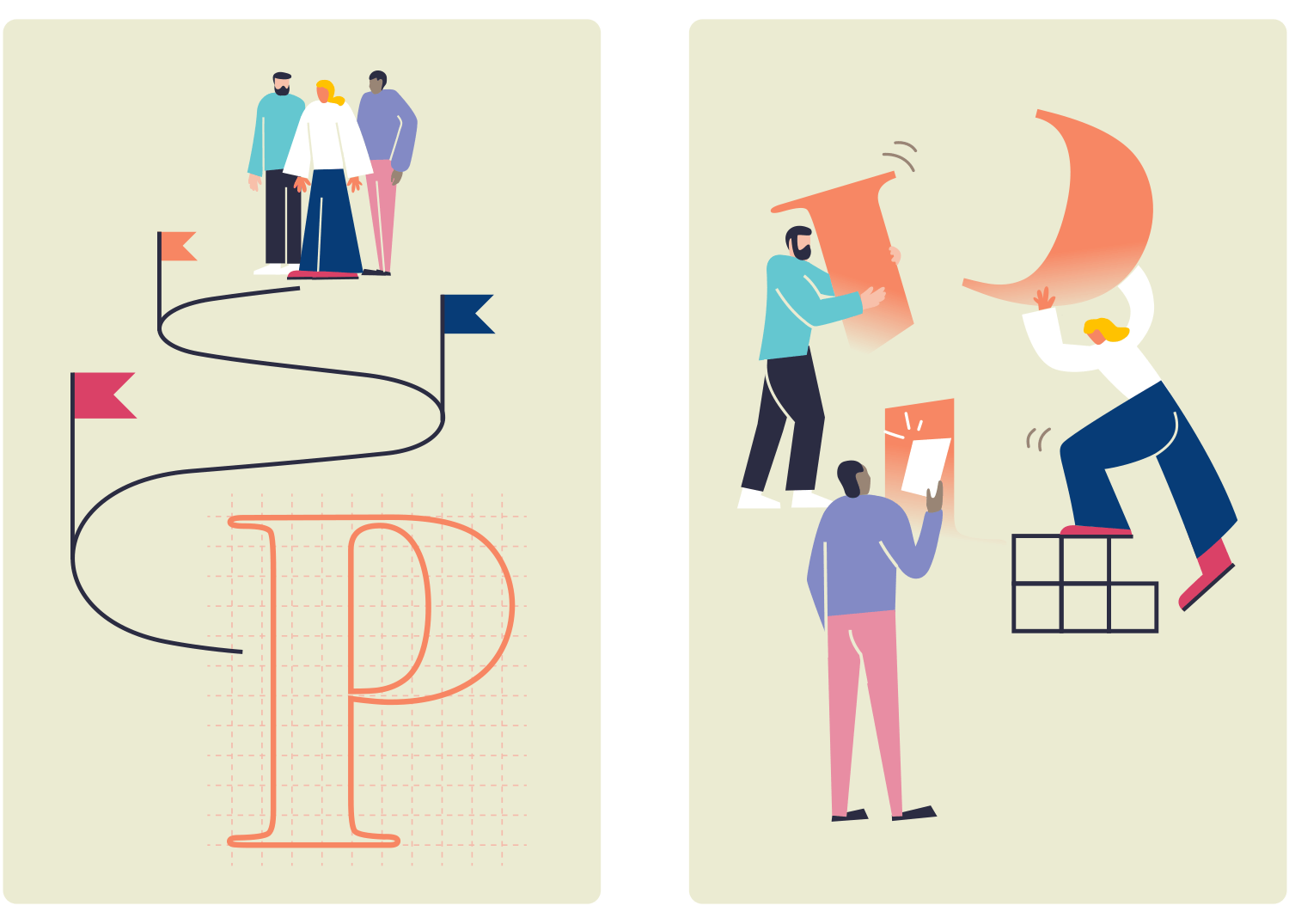
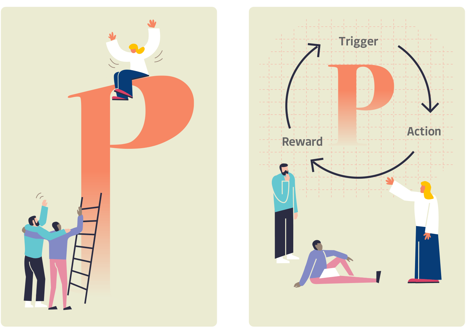
Illustrations.
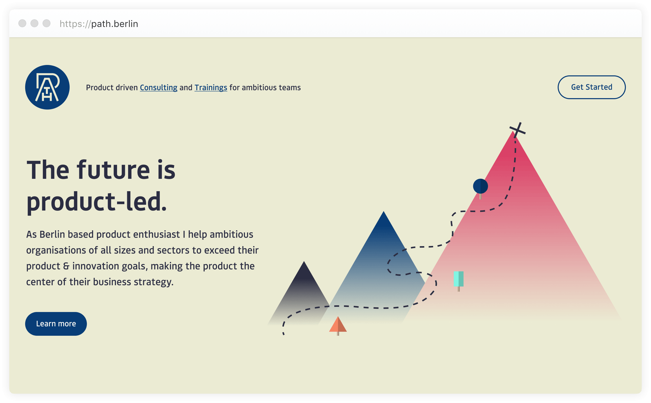
Homepage.
While working on further applications, it has become more and more apparent that this visual language doesn’t fully convey the company’s vision. The main points of criticism were - being generic and somewhat conservative.
We’ve abandoned this direction and started from scratch, only keeping the logo intact.
New visual language
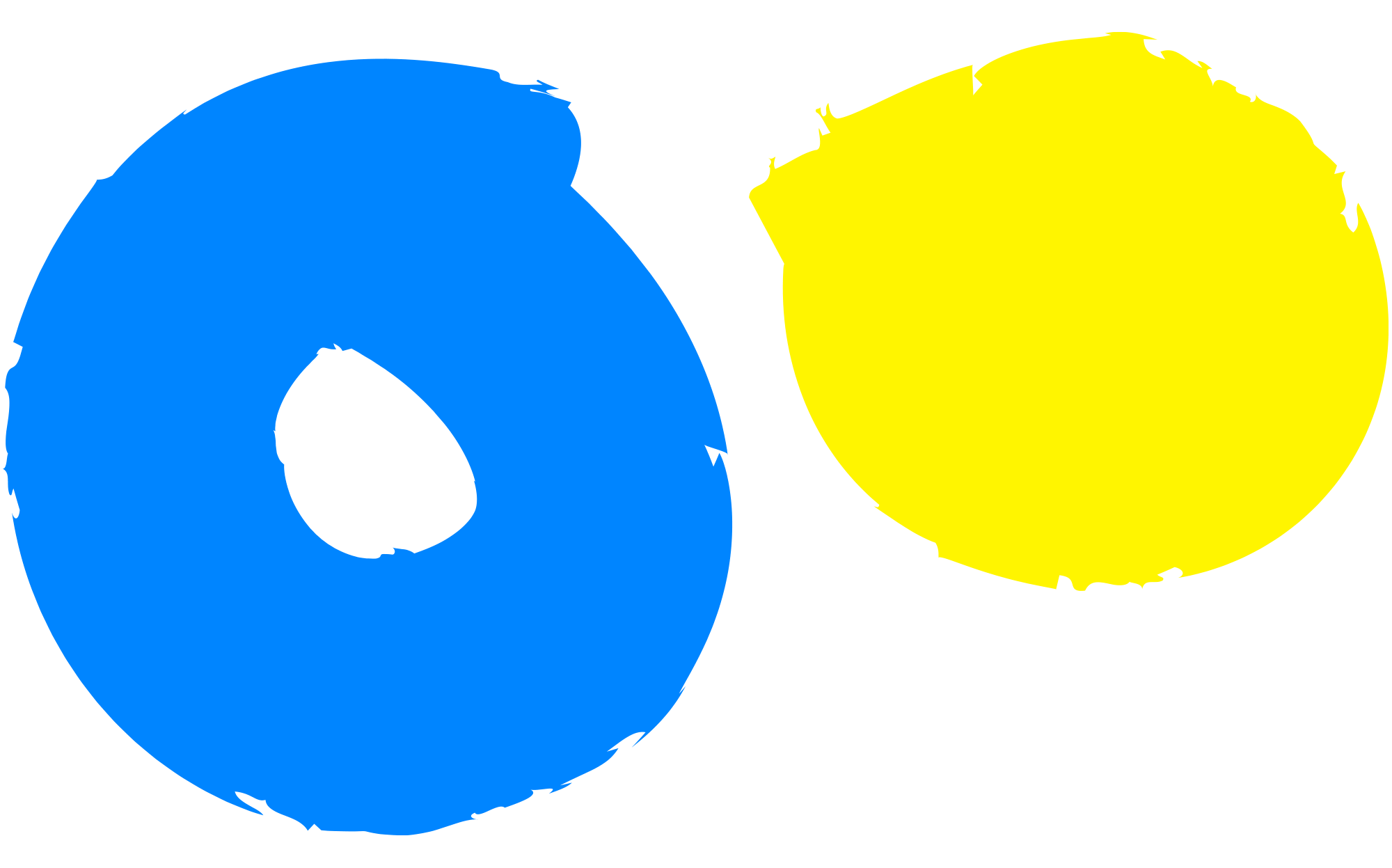
I’ve built new visual language around the vibrant and reduced color palette.
Logo animation.
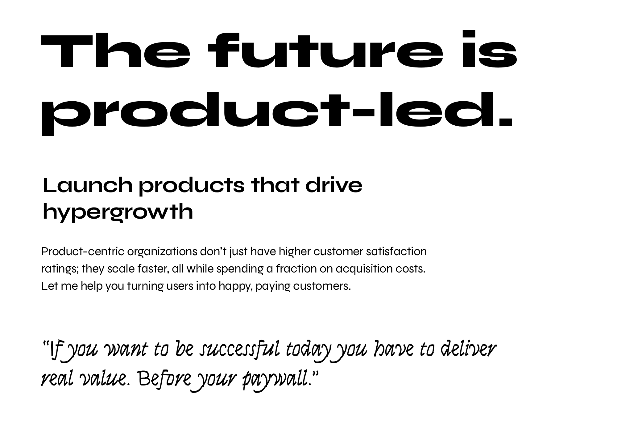
Syne typeface comes in 5 striking styles; when used together, they produce fresh and uncommon combinations.
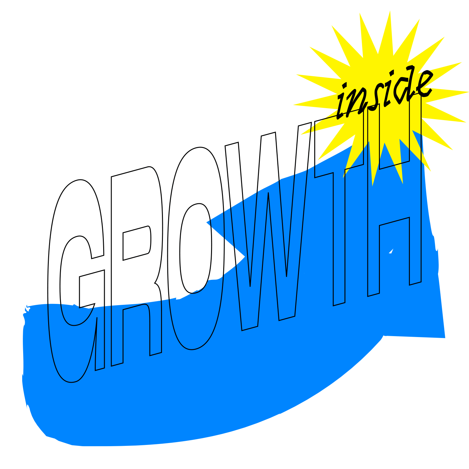
Illustrations became more personal and quirky.
Pattern.

The new homepage is using the Gatsby framework. Its basic functionality got extended with the Tina plugin. Tina allows us to embed real-time editing directly into the website - making updating and changing information convenient and easy.
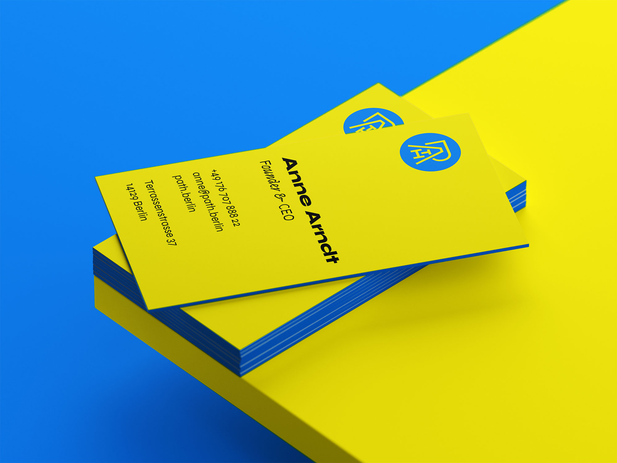
Business card.
Responsibilities
Art direction & design, visual identity, homepage implementation.
Tools & technologies used
Adobe Illustrator, Adobe Animate, Figma, Gatsby, AWS.
