Dark mode?
Dark mode or light-on-dark color scheme is a new popular trend in user interface design. Over the last few years, all the major OSes and apps have adopted the dark mode.
The key advantages of the dark mode are:
- Reduces eye strain in dim light
- Better for people with visual impairments
- Saves battery (devices with OLED displays only)
What about light mode? It’s still a preferred option for productivity-related tasks amongst the people with normal vision. But there might be long-term effects such as short-sightedness associated with it.
So, is the dark mode better than light mode? Unfortunately, there is no one-size-fits-all answer here. In the end, it’s about accessibility and user empowerment. Some people like the light mode - others, the dark mode. Having both and letting your users pick the one that fits them best - increases their enjoyment and makes for better user experience.
Colors
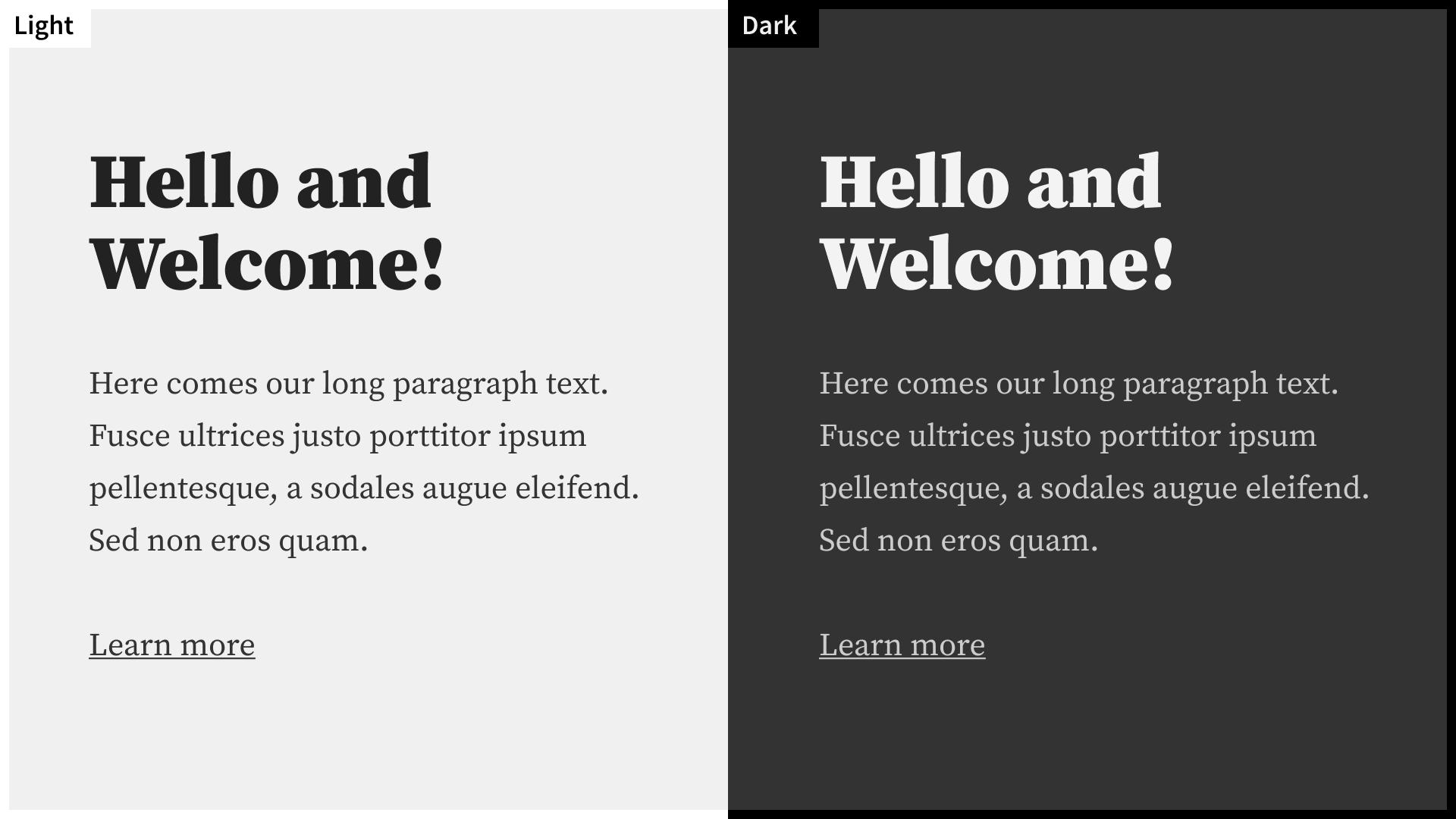
We’ll use a simple monochromatic color palette as a base. If needed, we can always expand it with more colors. Below is a quick mockup with both modes side by side.

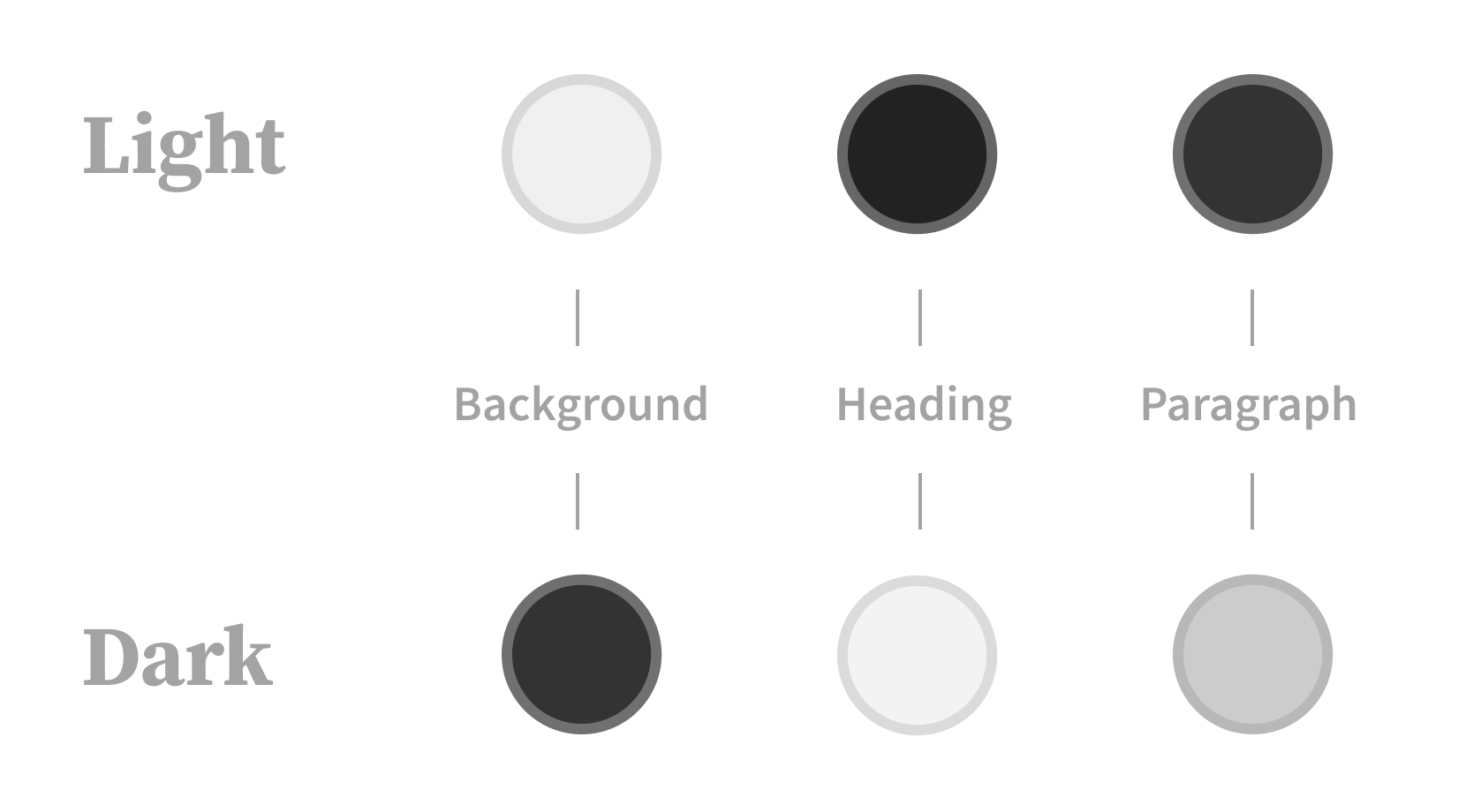
And colors for each mode separately:

A few things to keep in mind when working on a dark mode:
- Avoid high contrast color combinations (e.g., 100% white text on 100% black background).
- Highly saturated colors require less saturated dark mode counterparts.
- Light text may appear thicker on a dark background. Consider smoothing fonts with CSS, or using lighter font styles instead.
- How to display other visual content like images and videos? You can use one neutral image that works for both modes or two tailored images for each mode.
Controls
With colors in place, let’s create the user interface controls to allow users to switch between modes. Here are our basic requirements for this UI component:
- It has to be accessible and easy to find
- It must respect user’s system-wide setting by default
- It should save the user’s choice, once used
A toggle button seems to be a perfect candidate! On the page load, we will set it to OS preference. Later on, the user can switch to the desired mode with one click. And, as a plus, the toggle button is very compact.
After using a toggle for a while, I realized that it’s somewhat suboptimal. Once a user has clicked the toggle - there’s no going back to the OS defined preference. A user’s choice is always favored over an OS choice. This is annoying if you’ve set your OS color mode on auto, and you’re expecting the page to adapt to the same setting.
Adding the third auto option solves this problem. Yet, we have to replace the toggle. It’s not working with more than two options.
Both drop-down lists and radio buttons are suitable. Since we only have three options and we want them to be visible all the time - radio buttons are a better choice. Although they take more space than a toggle, we can partly tackle this by removing labels and using icons as selectable items.
Before we begin
- We’ll add the dark mode to the website built with Gatsby framework. The concepts described here can also be applied to any universal React app.
- This tutorial assumes you are familiar with React and Gatsby.
- The solution we’ll be building works in all popular browsers except Internet Explorer and Opera Mini.
- View the demo and the repository of the final result.
Setup
I’ve prepared another repository with all the necessary assets and dependencies needed for a quick start. You can clone it and install the dependencies by running following commands in terminal:
git clone https://github.com/taikn/adding-dark-mode.git
cd adding-dark-mode
npm install
Then start Gatsby’s development server:
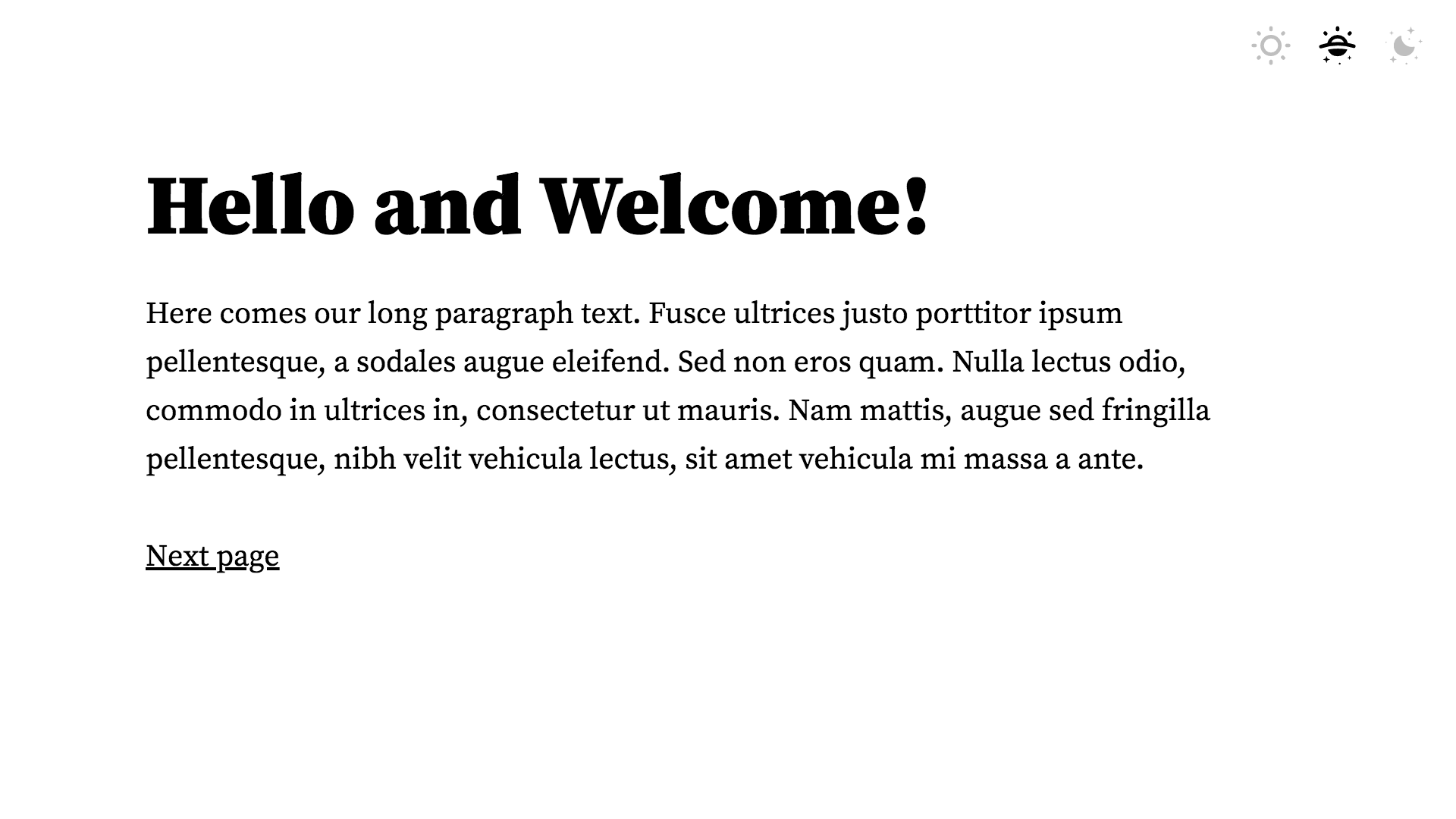
npm startIf you open http://localhost:8000/ in a browser, you will be greeted with the next screen:

Light mode
We’ll use CSS variables to define colors for both modes. With CSS variables, we get reactive components. Once a reference value of a variable change - corresponding elements update instantaneously. That’s exactly what we need when switching between modes!
Let’s open src/globals.css and set colors for the light mode at the beginning of the file:
/* light mode */
:root {
  --background-color: #f0f0f0;
  --heading-color: #222;
  --paragraph-color: #333;
}
Now we will reference these variables in our components.
In paragraph component - src/BodyParagraph/styles.module.css as a color property in .bodyParagraph class:
color: var(--paragraph-color);In heading component - src/PrimaryHeading/styles.module.css as a color property in .primaryHeading class:
color: var(--heading-color);In color mode icons - src/AutoIcon/index.js, src/DayIcon/index.js and src/NightIcon/index.js as a <svg> fill attribute:
fill='var(--heading-color)'And in <body> styles in src/globals.css, as a background color:
background-color: var(--background-color);See our page in light mode by navigating to http://localhost:8000/
Dark mode
To activate dark mode, we’ll make use of data attributes on <body> tag. By applying the data-color-mode="dark" selector, we can replace light colors with dark mode equivalents.
Add the following lines to the src/globals.css right after our light mode:
/* dark mode */
[data-color-mode="dark"] {
  --background-color: #333;
  --heading-color: #f3f3f3;
  --paragraph-color: #ccc;
}
Switching between modes
Having both color modes implemented, let’s add switching functionality to our controls.
First of all, we need to make color mode available to the components. The easiest way to achieve this is by using React Context.
Let’s create new components:
src/components/ColorModeContext/index.js
import React from 'react'

export const ColorModeContext = React.createContext({
  colorMode: undefined,
  switchMode: undefined,
  handleSwitch: () => {}
})
src/components/ColorModeProvider/index.js
import React, { useState } from 'react'
import { ColorModeContext } from '../ColorModeContext'

const determineColorMode = (switchMode) => {
  switch (switchMode) {
    case 'night':
      return 'dark'
    case 'auto':
      if (window.matchMedia(
        '(prefers-color-scheme: dark)').matches) {
        return 'dark'
      }
    // falls through
    default:
      return 'light'
  }
}

export default ({ children }) => {
  const [
    colorMode,
    setColorMode
  ] = useState('light')
  const [
    switchMode,
    setSwitchMode
  ] = useState('auto')
  const handleSwitch = (switchMode) => {
    setSwitchMode(switchMode)
    setColorMode(determineColorMode(switchMode))
  }
  return (
    <ColorModeContext.Provider
      value={{ colorMode, switchMode, handleSwitch }}
    >
      {children}
    </ColorModeContext.Provider>
  )
}
For now, we’ll keep initial values of colorMode and switchMode hard-coded, but we’ll get back to it in the next section.
To determine a new color mode, we’ve added determineColorMode utility function. It returns a color mode based on the provided switch value. When the switch is set to auto, we are checking if the user prefers dark mode with prefers-color-scheme: dark CSS media query. Otherwise, we fall through to the default light mode.
Lastly, we pass the current values of color and switch modes and the function to update both to the React Context.
To use ColorModeProvider in our app, we need to implement it with Gatsby’s wrapRootElement browser API. The same API is also available in SSR, and normally we would use the two together. But, color mode functionality is pointless outside the browser, so we can skip server-side rendering part for this tutorial.
Create a provider file in the src folder
src/providers.js
import React from 'react'
import ColorModeProvider from '../src/components/ColorModeProvider'

export default ({ element }) => (
  <ColorModeProvider>
    {element}
  </ColorModeProvider>
)
And add it to gatsby-browser.js as a wrapRootElement export:
import './static/fonts/fonts.css'
import './src/globals.css'
import wrapWithProviders from './src/providers'

export const wrapRootElement = wrapWithProviders
Next, let’s get handleSwitch and switchMode from the context and use it in our switch component.
src/components/ModeControls/index.js:
import React, { useContext } from 'react'
import styles from './styles.module.css'
import DayIcon from '../DayIcon'
import NightIcon from '../NightIcon'
import AutoIcon from '../AutoIcon'
import ModeRadioButton from '../ModeRadioButton'
import { ColorModeContext } from '../ColorModeContext'

export default () => {
  const {
    switchMode,
    handleSwitch
  } = useContext(ColorModeContext)
  return (
    /* same as before */
  )
}
As the last step, let’s add a component that will update data-color-mode attribute on <body> tag with new color mode value.
src/ColorModeAttribute/index.js
/* eslint-disable no-unused-vars */
import React, { useContext, useEffect } from 'react'
import { ColorModeContext } from '../ColorModeContext'

export default ({ children }) => {
  const { colorMode } = useContext(ColorModeContext)
  useEffect(() => {
    document.body.setAttribute('data-color-mode', colorMode)
  }, [colorMode])
  return children
}
Then wrap it around the layout component in src/Layout/index.js:
import React from 'react'
import styles from './styles.module.css'
import ModeControls from '../ModeControls'
import ColorModeAttribute from '../ColorModeAttribute'

export default ({ children }) => (
  <ColorModeAttribute>
    <ModeControls />
    <div className={styles.layoutContainer}>
      {children}
    </div>
  </ColorModeAttribute>
)
Now we can change color modes, though our choice is not persisted between page reloads.
Saving user’s choice
We want to store the switch value without an end date and across browser sessions. localStorage does exactly what we need and is very simple to use.
localStorage is supported in 95% of the browsers and is enabled by default. But it might not be accessible under certain conditions, or the user can also disable it. So before using it, we have to find out whether it is available, otherwise, we could get exceptions.
I've added a feature-detection utility into utils.js, that does the trick. We will import storageAvailable function, and if it turns truthy, make our localStorage calls.
Let’s revisit our color mode Provider:
src/components/ColorModeProvider/index.js
import React, { useState } from 'react'
import { ColorModeContext } from '../ColorModeContext'
import { storageAvailable } from '../../utils'

const determineColorMode = (switchMode) => {
  /* same as before */
}

const saveSwitchMode = (switchMode) => {
  if (typeof window === 'undefined') return undefined
  if (storageAvailable()) {
    window.localStorage.setItem('switchMode', switchMode)
  }
}

const getSwitchMode = () => {
  if (typeof window === 'undefined') return undefined
  if (storageAvailable() &&
    window.localStorage.getItem('switchMode')) {
    return window.localStorage.getItem('switchMode')
  }
  return 'auto'
}

const initialSwitchMode = getSwitchMode()

export default ({ children }) => {
  const [
    colorMode,
    setColorMode
  ] = useState(determineColorMode(initialSwitchMode))
  const [
    switchMode,
    setSwitchMode
  ] = useState(initialSwitchMode)
  const handleSwitch = (switchMode) => {
    saveSwitchMode(switchMode)
    setSwitchMode(switchMode)
    setColorMode(determineColorMode(switchMode))
  }
  return (
    /* same as before */
  )
}
We’ve created two more functions. saveSwitchMode to save new switch value. And getSwitchMode to get initial switch and color mode values. Both functions return undefined during server-side rendering due to absent window object.
And if switchMode is not defined, we are not showing the controls altogether.
src/components/ModeControls/index.js:
import React, { useContext } from 'react'
import styles from './styles.module.css'
import DayIcon from '../DayIcon'
import NightIcon from '../NightIcon'
import AutoIcon from '../AutoIcon'
import ModeRadioButton from '../ModeRadioButton'
import { ColorModeContext } from '../ColorModeContext'

export default () => {
  const {
    handleSwitch,
    switchMode
  } = useContext(ColorModeContext)
  if (!switchMode) {
    return <div className={styles.controlsContainer} />
  }
  return (
  	/* same as before */
  )
}
If you try switching to the dark mode and reloading the page, it will remain dark! But, you might have also noticed a flash of light mode, before our page went dark.
The effect is more pronounced in a production environment. Run the following commands in terminal:
npm run build
npm run serve
And then point your browser to http://localhost:9000/
Our page is pre-rendered and sent to the browser in the default light mode. And it remains in a light mode until all the needed assets are loaded and React re-hydrates.
To resolve this issue, we need to set the real color mode attribute on <body> tag right after it becomes available to JavaScript. This way, we will ensure the right color mode while parsing the remaining HTML, loading the rest of the assets, and initializing React.
Add a new file to the src:
src/colormode.js
export const initColorMode =
(function () {
  function storageAvailable () {
    var x = '__storage_test__';
    try {
      window.localStorage.setItem(x, x);
      window.localStorage.removeItem(x);
      return true;
    } catch (e) {
      return e instanceof DOMException && (
        e.code === 22 ||
        e.code === 1014 ||
        e.name === 'QuotaExceededError' ||
        e.name === 'NS_ERROR_DOM_QUOTA_REACHED') &&
        (window.localStorage &&
         window.localStorage.length !== 0);
    }
  }
  function getSwitchMode () {
    if (storageAvailable() &&
      window.localStorage.getItem('switchMode')) {
      return window.localStorage.getItem('switchMode');
    }
    return 'auto';
  }
  function determineColorMode (switchMode) {
    switch (switchMode) {
      case 'night':
        return 'dark';
      case 'auto':
        if (window.matchMedia(
          '(prefers-color-scheme: dark)').matches) {
          return 'dark';
        }
      default:
        return 'light';
    }
  }
  function setInitColorMode () {
    document.body.setAttribute('data-color-mode',
      determineColorMode(getSwitchMode()));
  }
  setInitColorMode();
})();
Inside colormode.js is an IIFE containing functions we were previously using to identify the color mode based on a selected switch. The result is an actual color mode set by setInitColorMode function as a data attribute on <body>.
Note that our function is, in fact, a string. We will inline it into our HTML to speed up its execution and cut the pausing of the HMTL parser.
Let’s add it to our HTML during server-side rendering.
Create a gatsby-ssr.js:
import React from 'react'
import { initColorMode } from './src/colormode'

export const onRenderBody = ({
  setPreBodyComponents
}) => {
  setPreBodyComponents(
    <script
      key='initColorMode'
      dangerouslySetInnerHTML={{ __html: initColorMode }}
    />
  )
}
Here we are using Gatsby’s onRenderBody API and its setPreBodyComponents function to inject the script precisely after the opening <body> tag.
Check how the page behaves after these adjustments by creating new production build and serving it locally.
Hooray, the nasty flickering is gone!
Finishing touches
Currently, the background switching between modes is too abrupt. Let’s smoothen it with CSS transitions.
Open src/globals.css and append this to the <body> styles:
transition: background-color 0.25s ease-out;If you try switching modes, you will notice a seamless background change. But the effect will also fire within the initial page load, which is undesirable.
We can fix it by adding temporary data attribute to the <body> when rendering our HTML on the server.
gatsby-ssr.js
import React from 'react'
import { initColorMode } from './src/colormode'

export const onRenderBody = ({
  setBodyAttributes,
  setPreBodyComponents
}) => {
  setBodyAttributes({
    'data-loading': true
  })
  setPreBodyComponents(
    <script
      key='initColorMode'
      dangerouslySetInnerHTML={{ __html: initColorMode }}
    />
  )
}
And then removing it after the whole page is loaded on the client-side.
gatsby-browser.js
import './static/fonts/fonts.css'
import './src/globals.css'
import wrapWithProviders from './src/providers'

export const wrapRootElement = wrapWithProviders
export const onClientEntry = () => {
  window.addEventListener('load', () => {
    document.body.removeAttribute('data-loading');
  })
}
Now data-loading="true" is present on <body> only while the page is loading. Let’s make sure no transitions occur throughout this period.
Modify src/globals.css by adding following CSS right after the <body> styles:
[data-loading="true"] {
  transition: none;
}
Here is the final result: